EA · Star Wars: Galaxy of Heroes
Store Revamp
A redesigned shopping experience for discovery, scalability & clarity — rebuilding the storefront and pack details of the #1 Star Wars mobile game without destabilizing a live, revenue-critical economy.
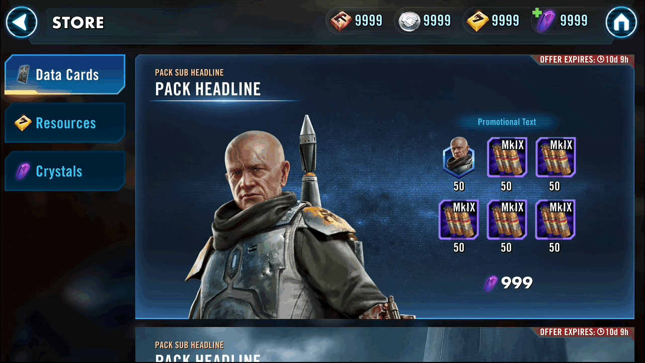
One store, two connected surfaces
The redesign covered the two surfaces where almost all of the game's monetization happens, treated as a single system rather than separate screens:
Part 1 · Storefront
- The browsing surface — categories, navigation, and the modules that present every offer.
- Goal: improve discoverability & layout scalability.
Part 2 · Pack Details
- The detail view a player taps into before deciding to buy.
- Goal: improve information clarity.
Why the store matters
Star Wars: Galaxy of Heroes is the #1 Star Wars mobile game of all time. Players build a squad, level up their characters, defeat enemies and win rewards across a deep live-service economy — and the Store is the backbone of two of those loops at once.
Progression backbone
- The store is where players acquire what they need to keep advancing their roster.
Monetization backbone
- It is the primary surface driving the game's revenue.
Who's shopping
A store has to serve very different buyers at once. Mapping spend behavior against store metrics — pack click-through % and store visits % — surfaced three segments the redesign had to balance:
Heavy Spenders
Decisive buyers who spend weekly.
New Players
Spend when the value is clear.
Deal-driven Spenders
Spend only on compelling offers.
New players and deal-driven spenders represented the biggest opportunity: both convert when value is made obvious, which is exactly what a uniform, hard-to-scan store failed to do.
Analyzing the current experience
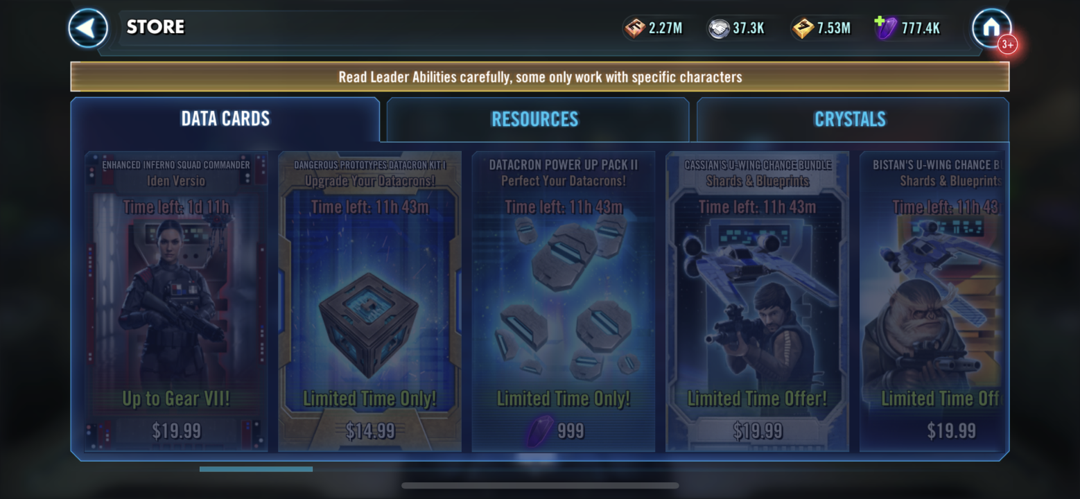
An audit of the live store, paired with store analytics, surfaced six concrete problems — split across the storefront and the pack details.
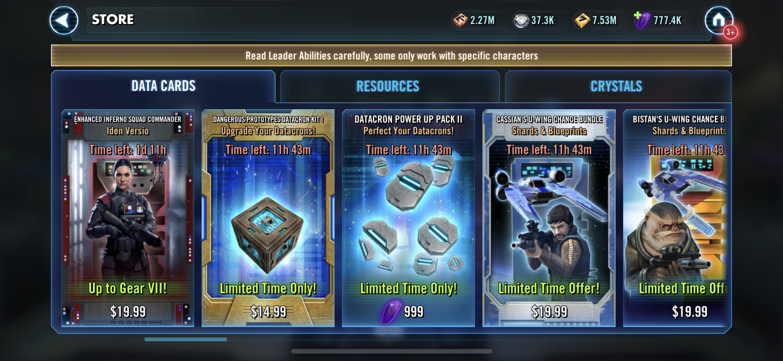
High-value offers lacked visibility
Uniform modules made promotional and priority packs harder to discover.
Low pack-info readability slowed browsing
Low contrast between cover art and text reduced readability.
Navigation created interaction friction
Top navigation was harder to reach and limited future category expansion.
The browsing model limited discoverability
Horizontal scrolling reduced content visibility and made offer comparison less efficient.
Text-dependent mechanics increased cognitive load
Players had to read long descriptions to understand pack mechanics before purchasing.
Unclear grouping reduced pack clarity
Players struggled to understand which items belonged together.
Two surfaces, two clear mandates
The six problems resolved into two design mandates — one per surface — which framed every decision that followed.
Storefront
- Improve discoverability & layout scalability.
Pack details
- Improve information clarity.
From a uniform list to a scannable system
UX patterns research
I studied storefront patterns across games and commerce apps to ground the direction in four principles:
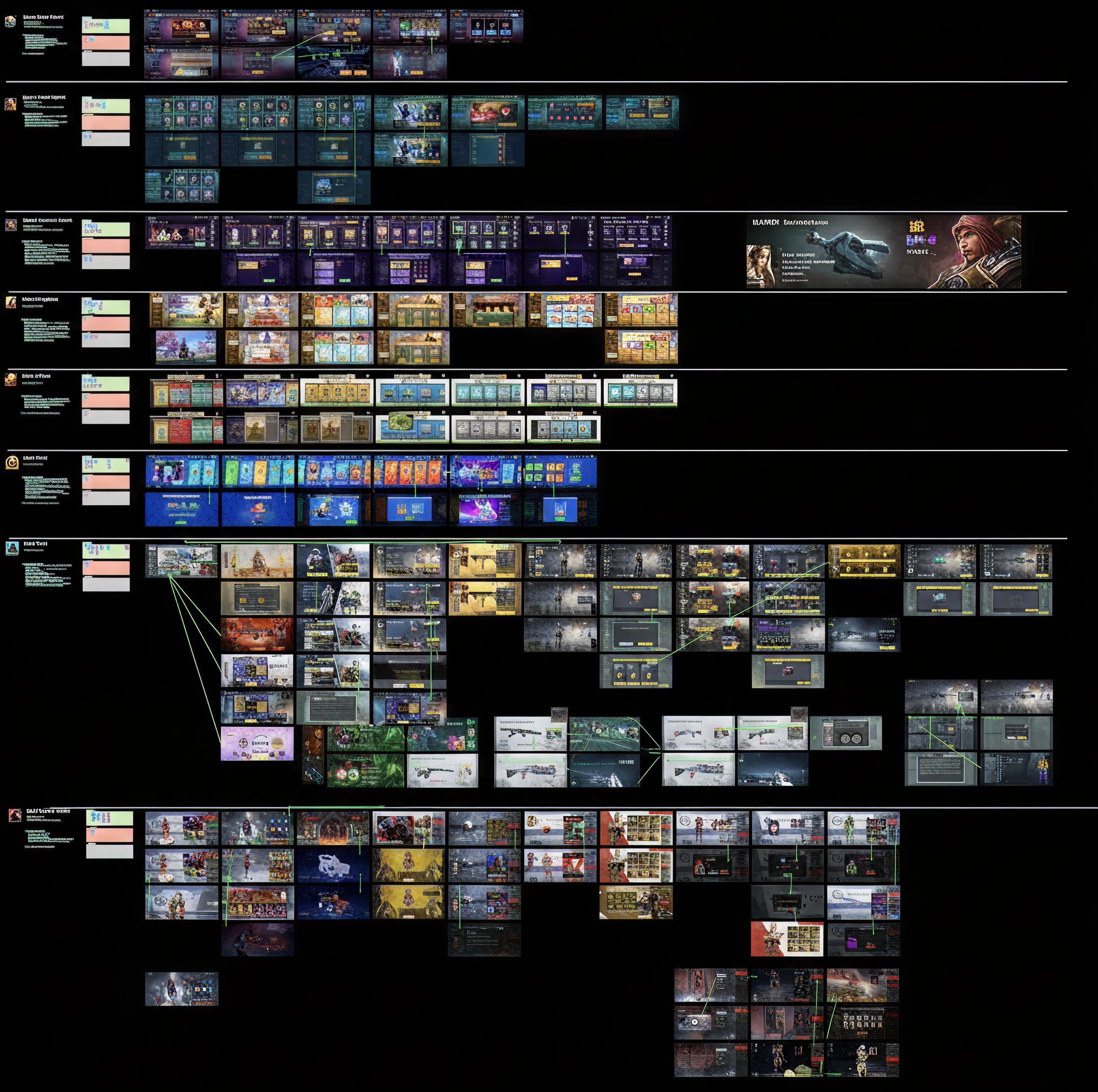
- Align interactions with thumb reach in landscape.
- Vertical layouts improve scanability.
- Larger modules create stronger visual hierarchy.
- Clear visuals and item details increase perceived value.
Vertical Tab Bar
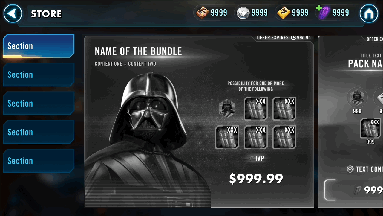
I replaced the hard-to-reach top navigation with a vertical tab bar: thumb-friendly in landscape, icon-led for clarity, and scalable to a content-rich store with more categories over time.
Exploring module sizes
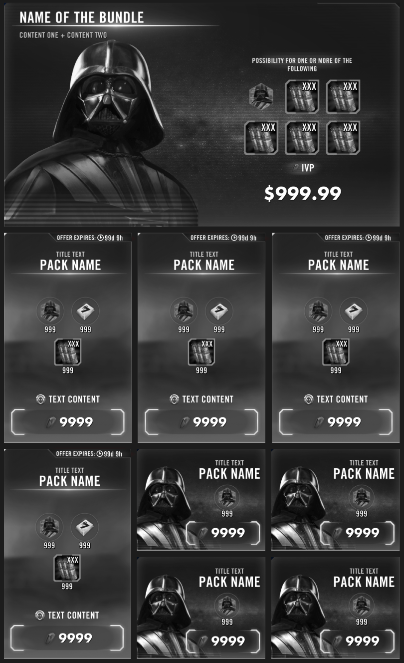
To create hierarchy, I introduced variable module sizes — Default, Large, and Mini — adapting the layout to promote high-value offers while optimizing screen space.
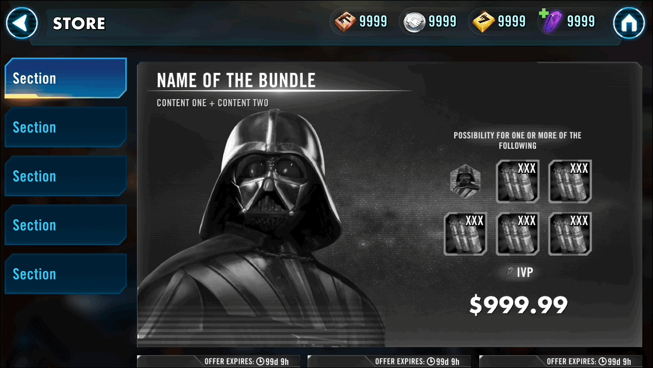
Scrolling: horizontal vs. vertical
I prototyped both scroll models. Horizontal scrolling was less intuitive, harder to scan, and poor for mixed-size content — so vertical scrolling won, pairing naturally with the modular grid.
Refined pack modules
I rebuilt the module itself to do more with less: an expanded art area to showcase the IP fantasy and boost engagement, an item preview to clarify pack value, visual cues for quick recognition of offer type, and uniform timers for faster recognition and stronger urgency — all while staying optimized for space and backward compatibility.
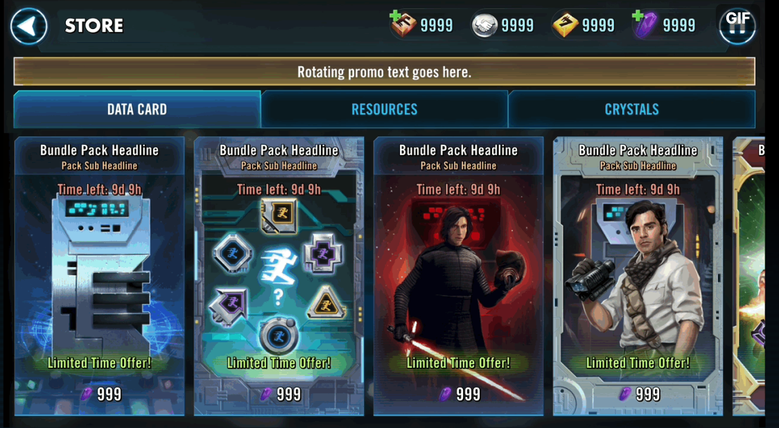
Promotion popup revamp
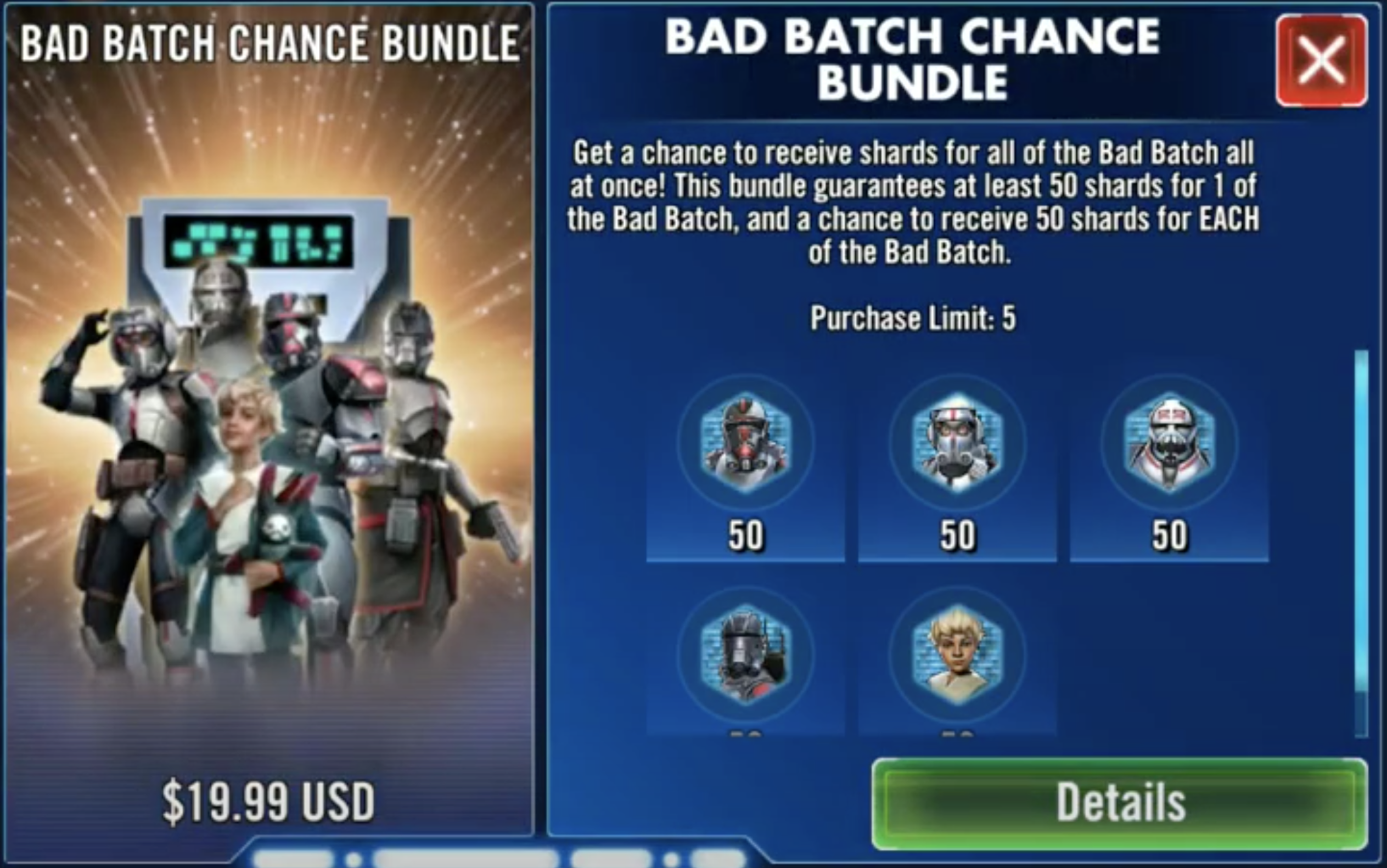
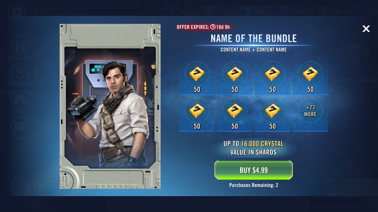
As part of Phase 1, I upgraded the promotional popup module to highlight spotlight offers — the first impression most players see when the store opens.
Making pack mechanics legible
Why it's unclear
Various pack mechanics, but one rigid UI layout.
The legacy detail view used a single template for every pack — regardless of how its rewards actually worked — so players had to read fine print to understand what they were buying.
Decoding pack mechanics
I collaborated with PMs to identify categories, top sellers, value tiers, and edge cases — the framework that shaped the information design. Packs broke down along a spectrum from fully deterministic to chance-based:

What You See Is What You Get
Fully deterministic — a fixed item and quantity.
Gacha
A mix of fixed and random elements.
Chance-Based Drops
Rewards driven by odds.
Mapping 8 pack types into 4 UX quadrants
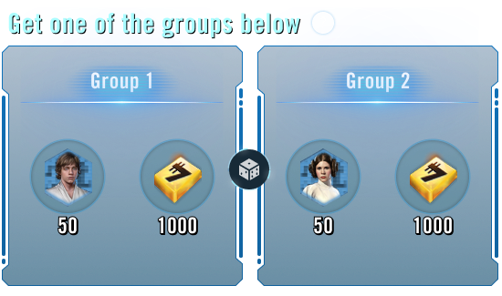
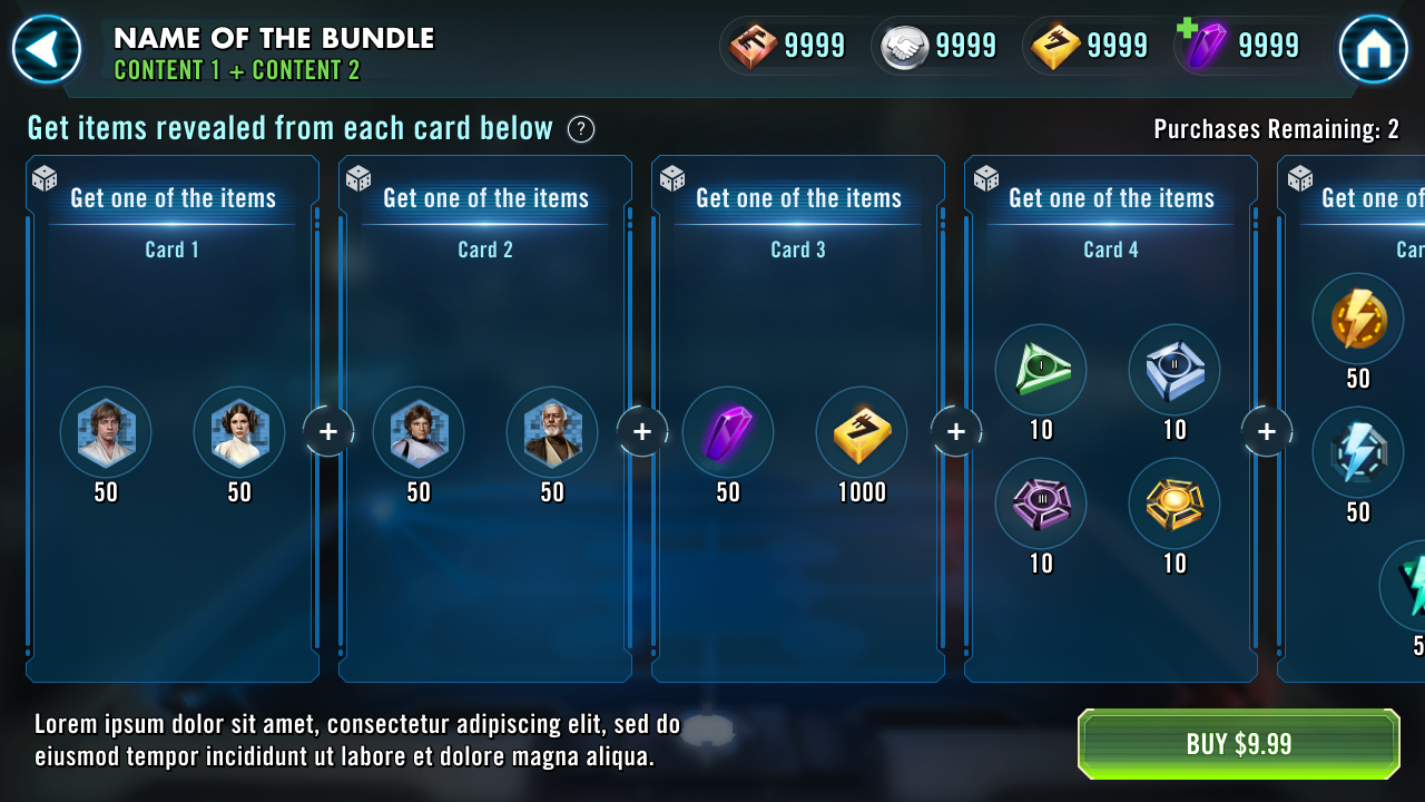
Classifying packs by reward logic — along Fixed vs. Random Item and Fixed vs. Random Quantity axes — collapsed eight real pack types into four predictable layouts, so information design could be consistent instead of bespoke.
Deterministic — show exactly what's inside.
Known item, variable amount.
Set count, drawn from a pool.
Fully chance-based — communicate odds clearly.
Visual-first communication
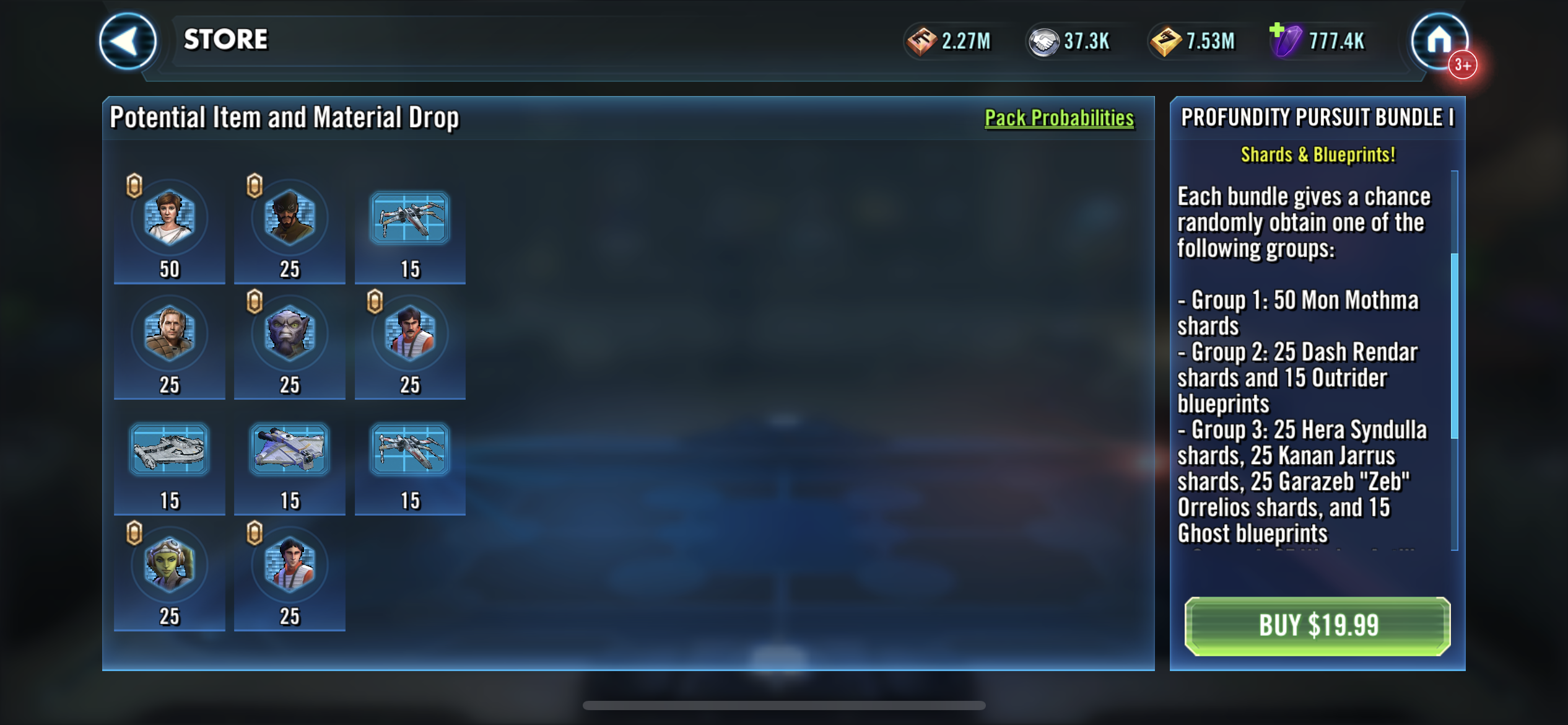
The redesign lets structure carry the meaning: visual clarity removes the need for long explanations, making decisions quicker and easier. The new pack-detail layout reduces text dependency and aligns with existing game-wide UI conventions — the pack name now lives in the store title bar — while maximizing layout space for packs with more content.
Phased rollout into a live economy
In a revenue-critical economy you can't ship everything at once. I sequenced the work into three phases, each scoped to balance UX impact, development cost, revenue impact, and user adoption.
Fix the interaction
Improve navigation scalability (Vertical Tabs) + revamp promotional popups.
Fix the hierarchy (layout)
Enhance storefront discoverability with the Tetris modular storefront.
Reduce cognitive load
Improve pack-detail clarity with the Gacha Matrix UI implementation.
Business impact
Each phase was validated against live store metrics before the next shipped. The redesign moved the funnel in the right direction without destabilizing the economy.
The lift among light spenders mattered most — the hardest segment to convert — confirming the redesign lowered the barrier to a first purchase rather than just shifting existing spend around.
What I'd carry forward
Reduce friction first
Prioritize reducing friction over adding complexity.
Clarity is leverage
Clarity drives both player experience and business impact.
Work within constraints
Prioritize within real constraints — cost, risk, and a live economy.
Above all: focus on high-impact improvements. Sequencing by impact and risk is what let a six-problem audit ship safely as three coherent moves.